In modern design systems, especially those serving large and complex websites, component reuse is essential for scalability, efficiency, and consistency. But sometimes, that consistency breaks down—not in code, but in the user experience.
One increasingly common example: reskinned radio buttons.
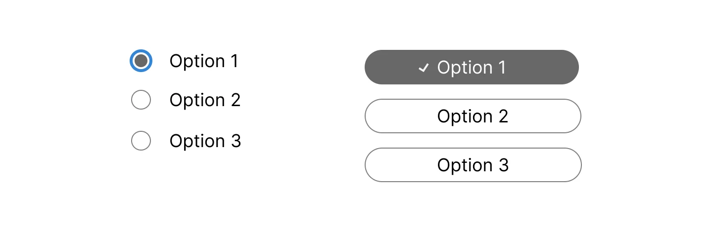
Let’s say your design system contains two different components for radio buttons. One follows the standard, recognisable visual pattern users expect. The other is functionally a radio button group in code, but visually it looks nothing like one—perhaps styled as segmented controls, toggles, or a list of buttons. Same semantic intent, radically different visual appearance.
So, what’s the problem?
As a UX designer and accessibility specialist, I’ve seen how subtle design choices can have significant consequences—especially for users with cognitive or perceptual disabilities. Let’s unpack the pros and cons of reskinning radio buttons and why having multiple visual versions in your design system can hurt usability and inclusivity.
The Appeal of Reskinning Radio Buttons
Custom Aesthetics & Branding
Designers may want to break away from browser defaults to achieve a more polished or branded interface. Styled radio buttons can feel more “on brand” and give more control over the look and feel.
Enhanced Interaction Models
Reskinning might help in certain contexts—like making options appear more tactile or app-like, especially on mobile, where native inputs can feel too small or fiddly.
Semantic Accuracy in Code
In the best-case scenario, the underlying code uses semantic radio inputs (e.g. input type="radio") with proper labelling and grouping. So screen reader users may still experience the interaction correctly.
The Risks and Drawbacks
Loss of Recognisability
Visual consistency is key to cognitive ease. Radio buttons are a well-understood UI pattern—people know what they are, how they behave, and what selecting one means. When you strip away that visual identity, users are left guessing:
- Are these toggle buttons?
- Can I select more than one?
- What happens if I click again?
This is especially problematic for:
- People with cognitive disabilities who rely on familiar patterns
- Older users with lower digital literacy
- Screen magnifier users who benefit from scanning known shapes
Inconsistent Mental Models
When a site uses multiple styles of radio buttons, it fragments the user experience. Two components that do the same thing but look different can create confusion and force users to re-learn interactions. This inconsistency contradicts usability heuristics like “consistency and standards” and “recognition rather than recall.”
Accessibility Pitfalls
Even if your custom radio buttons are correctly coded, styling them in a way that hides or changes expected states—like focus, checked, or disabled—can make them inaccessible. Common issues include:
- Missing visible focus indicators
- Ambiguous selection states
- No indication of mutual exclusivity (i.e., that only one option can be selected)
Users with ADHD, autism, or dyslexia benefit from clear, familiar interfaces. Over-styling can erode that clarity.
Design Debt and Maintenance Overhead
Having multiple components that do the same thing creates duplication and technical debt. It’s harder to maintain, test, and update, and increases the chance of bugs or inconsistent behaviour. It also raises the learning curve for new designers and developers joining the team.
Supporting Research
W3C WAI – Cognitive Accessibility Guidance
The W3C Cognitive and Learning Disabilities Accessibility Task Force (COGA) provides extensive guidance that directly supports the value of consistency:
“Provide a consistent user interface so that users know what to expect and can learn how to use the system more easily. Consistency reduces cognitive load and enhances usability.”
– W3C: Making Content Usable for People with Cognitive and Learning Disabilities
WCAG and Success Criteria 3.2.x – Predictability
The Web Content Accessibility Guidelines (WCAG) include Principle 3: Understandable, which contains:
- SC 3.2.3: Consistent Navigation
- SC 3.2.4: Consistent Identification
These require that components and navigation mechanisms appear and behave in predictable, consistent ways across pages. While WCAG applies to all users, its benefit for users with cognitive disabilities is especially clear:
“Consistency helps people with cognitive limitations by reinforcing patterns, reducing the need to relearn or reorient with each interaction.”
– Understanding WCAG 2.2 – SC 3.2.3 and 3.2.4
Nielsen Norman Group – Usability Heuristics
Jakob Nielsen’s 10 usability heuristics include:
- “Consistency and standards”
- “Recognition rather than recall”
These are critical for all users but particularly for those with cognitive disabilities, who may struggle more with memory, problem-solving, and attention.
“Users should not have to wonder whether different words, situations, or actions mean the same thing.”
– Nielsen Norman Group: 10 Usability Heuristics
Research: Accessibility for People with Cognitive Disabilities
A study titled “Web Accessibility for People with Cognitive Disabilities” by Lazar, Olalere, and Wentz (2012) notes:
“Participants with cognitive disabilities demonstrated improved task success and reduced time-on-task when presented with interfaces that were visually and functionally consistent.”
This supports the direct impact of consistency on cognitive load and user success.
Inclusive Design Principles
The Inclusive Design Principles initiative highlights:
“Consistent and predictable interactions support people with cognitive and learning disabilities by reducing confusion and allowing them to form reliable mental models.”
Better Approaches
Instead of reinventing the wheel, consider these options:
- Use a single, accessible, custom-styled radio button component that supports theme and layout variations while preserving recognisable structure.
- Document clear visual and behavioural guidelines in your design system so teams know when and how to use the component consistently.
- Test with diverse users, including people with cognitive impairments, to ensure your styling choices don’t introduce barriers.
Conclusion: Design for Recognition, Not Reinvention
Radio buttons are simple, but powerful. When used consistently, they provide an intuitive, low-friction way for users to make choices. But when we strip them of their identity in pursuit of a sleek UI, we risk creating confusion, inconsistency, and accessibility issues—especially for those who need clarity the most.
In a component-based design system, it’s essential to prioritise recognisability, consistency, and accessibility. A single well-designed, adaptable radio button component will serve your users—and your team—far better than two competing interpretations of the same pattern.